The Selleran Model
Selleran’s value was built upon combining all typical industry services into one platform, with a strong focus on ease of use. Unifying the fragmented world of affiliate marketing and payment processing spaces SaaS required to be competitive into a single platform was a daily in depth undertaking.
Traditional players in this space needed to juggle multiple web apps that added complication along with the exhaustive reconciliation methods to retain meaningful data. Our team was brought in to build this from the ground up, working closely with the team to design user flow, capabilities, and functionality.
Automation
The automated store building function of Selleran allowed users to create an online store that was fully linked to the Selleran API through a rapid setup wizard. This store would feature an approved template, populated with product lines, linked to processing, shipping, customer support, and the Selleran admin portal.
Client
Selleran was conceived of by a team of affiliate and payment space lifers looking to disrupt the current way of managing offers.
The Brand
Look and Feel
We sought to create the feeling of modern, clean, and easy to navigate for this project. The colors were chosen to feel crisp and serious, but in no way stuffy or corporate. It was important to the team to make the brand feel non-intimidating.
Target Audience
The majority of the target audience are used to interacting with digital platforms from more traditional banking portals, to far more contemporary marketing networks. We chose typography that would place the company squarely in the newer age of platforms, which we felt was harmonious with the incorporated functions layout.

The platform
We were tasked with bringing all of these functions under one roof for the Selleran platform. Furthermore, there was a strong emphasis on ease of use, despite large technical capabilities there was a need for on-boarding users with minimal to no training as a key need of their scaling plans.

Intuitive dashboards
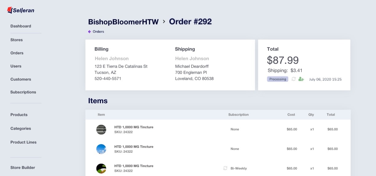
The SaaS industry tends to throw around the term ‘intuitive’ to the point of banality, however we feel we were able to truly capture a design structure that allows even novice users to utilize the platform fully. that Substantial workflow mapping allowed us to ultimately design an entire ecosystem of functions in such a way that navigation wasn’t overwhelming and required minimal training.
Commissions and Remarketing
Further automation in the form of omnichannel remarketing gave the system additional tracking and rewarding functionality. Downline agents could access marketing creatives approved by each product line owner, giving them significantly more tools to increase sales with.


Permission levels
As a requirement for their business model we created multiple levels of permissions and logins that essentially would give a platform experience based on the user’s role within the company. Functionality in these layers featured many automated capabilities that allowed scaling and ease of bookkeeping for Selleran.
Total control
One example was downline agents, whose access to multiple product lines featured automated payouts to above and below agents based on Schedule A structures set by super admins.
Built-in-store analytics
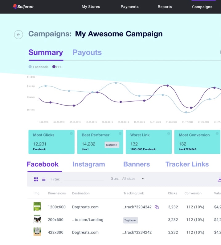
A significant problem faced by many in this space is the inability to distill actionable data due to incapacity or improper reconciliation across the various services. This is an area where a single system shines, all information could be presented in quick-to-intuit premade or custom reports since all data originated from within the one platform
Campaigns and Assets Builder
An aim of the system was to make agents more successful, a number of marketing features were built in to support this effort. The previously mentioned creatives repository had tracking pixels optimized for various platforms embedded. These pixels would feed not only omnichannel remarketing but also reports for both agents and product line owners.

State of the art admin system
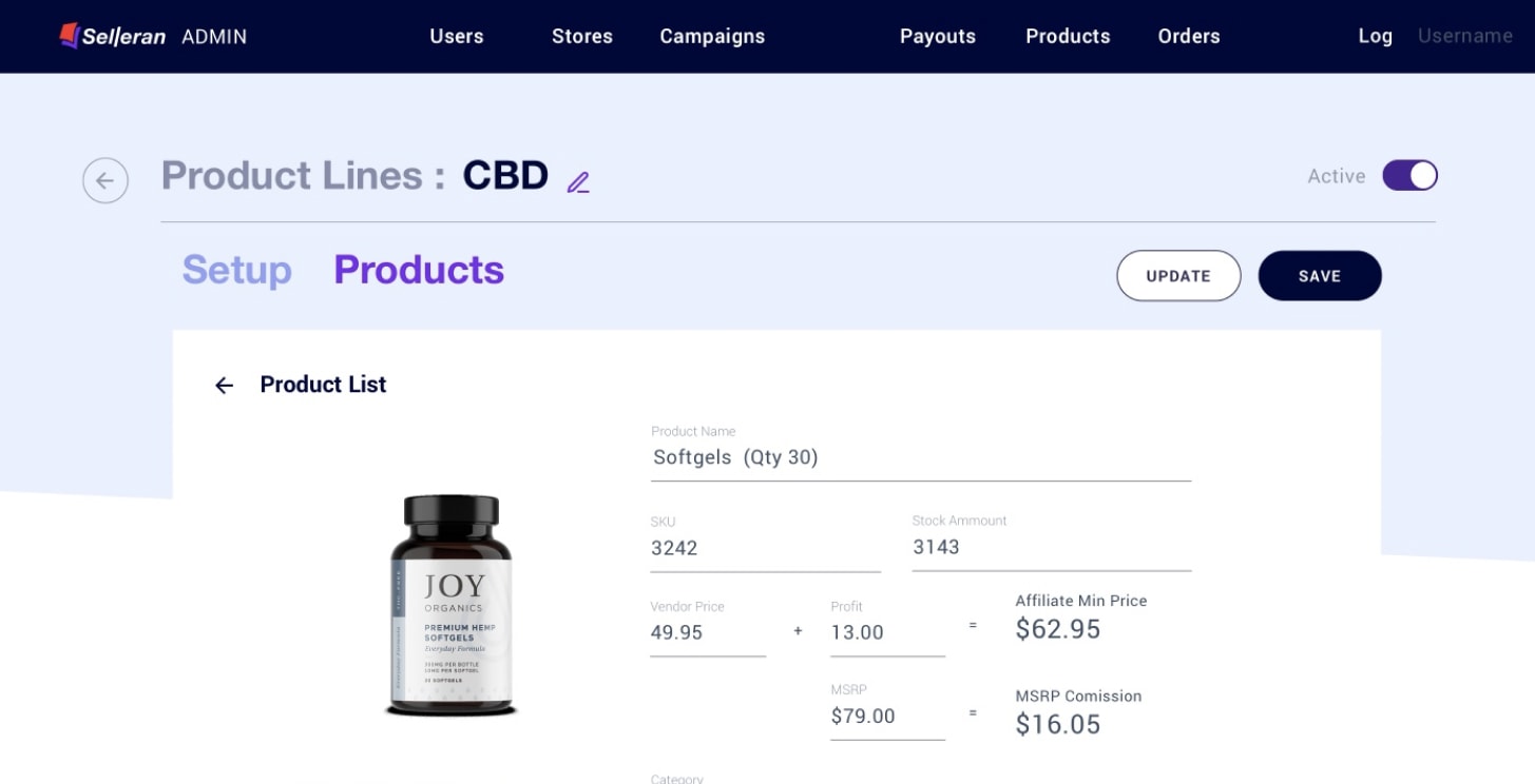
The heart of the system was the backend portal, however, given the depth of information contained in the system, it was necessary to limit visibility and functionality to certain types of users. To accomplish this without impacting user experience a number of levels of users were crafted to meet these requirements in a superior way to the typical

Results
The result of combining all these tools under one roof was an ease of onboarding customers from other platforms. The team found the typical uphill battle of the sales process significantly easier as the value proposition spoke so directly to pain points common amongst the audience.